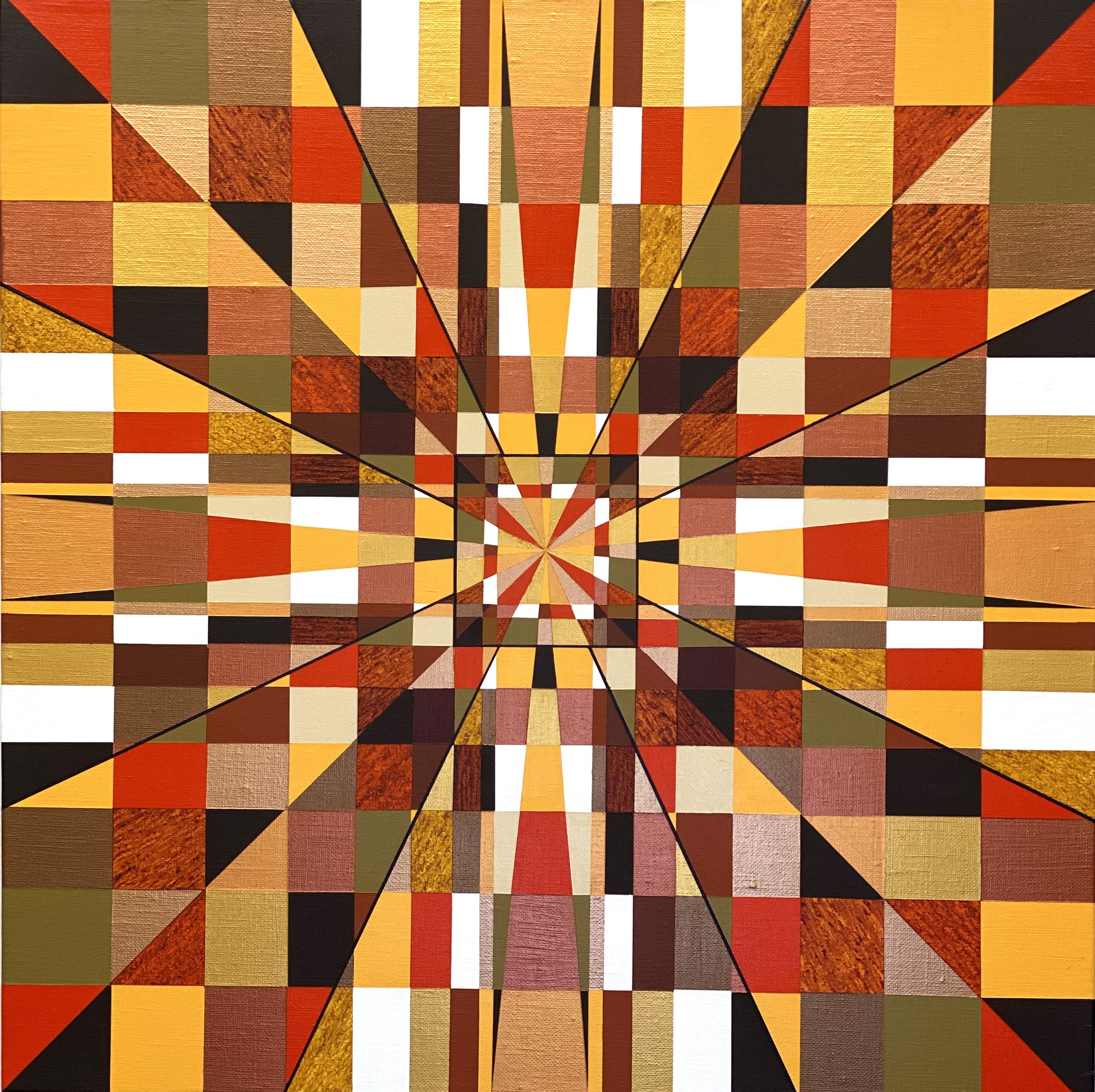
Depth Perception
20 in x 20 in
02/2021
This painting was one of the first times I added highlight lines after all the colors had been laid down. I decided to put thin black lines coming in centrally from the corners to give depth to the piece. I also used several “transparent” acrylics that are see through, and laid them down in a pattern matching the angles and positions of the shapes coming from the center. I used warm golds, coppers, browns, reds, oranges and muted yellows for this piece. Symmetry was what I was going for in this one, and when I was finished with the piece, I was struck at how "3-D" it looked.

