Almost all of the paintings that I do start with laying down a precise geometric grid on canvas. I then use a mix of opaque, transparent and metallic acrylic paints to complete the piece, isolating distinct shapes on the grid and blocking them off with painter’s tape. Each of my compositions, which tend to be rich in color and vibrancy, explores the many ways light refracts, splinters, and harmonizes. I view color as an interesting metaphor for humanity. Each one of us, like an individual color, is unique and beautiful, but we can be so much more when we interact with each other in meaningful, cooperative and logical ways. The textures and shapes of the paintings I create mirror the complexity of being human – unpredictable, interrelated, and yet somehow ordered. On this page, I will describe my artistic process in chronological order- from the initial inspiration, to the final painting. I will use my first commissioned work, “All Charged Up,” as an example. 
I was commissioned to do a painting similar to “The Shield” but referencing the LA (formerly San Diego) Chargers NFL football team. Although the Charger’s main logo is one of a semicircular lightning bolt, my client and I agreed the piece didn’t necessarily have to include such a literal symbol. In my attempt to reference the Chargers without losing artistic freedom, I decided I would incorporate 4 strait lightning bolts in a symmetric pattern as a nod to their famous logo.


First, I found an image on the web showing a Chargers player in a uniform that features a nice lightning bolt, in this case a vertical one down the uniform.
I copied the image and generated a lightning bolt in PowerPoint to replicate the one on the football player.
Next, I sketched out” my idea for the painting in PowerPoint and scaled up the lightning bolt to be proportional to the painting.
I ordered a 3 ft x 3 ft canvas with portrait-smooth acrylic primed surface from Masterpiece, my preferred source of canvases. I also ordered a bunch of yellow and blue acrylic paints from Blick Art (my preferred source for paints). Next, I made a color reference chart on poster board to see what each color would look like once dry. For each, I applied the paint uniformly, and also “bouncy” to see what they would look like when textured. I ended up using a variety of blues, yellows and whites in “All Charged Up”, including several custom colors that I blended myself.


I scaled up the lightning bolt to fit the 3 x 3 canvas, printed it out (in 3 separate sections; taped them together), transferred the image to poster board (to get stiffness), cut it out for use as a stencil, and tested out the dimensions on an imaginary canvas on my painting table to confirm they would fit the way I envisioned they would.


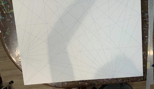
I used the corners and the geometric middle to lay down the beginnings of a grid. I used the poster board stencil to draw in the lightning bolts. I chose a different color pencil to help me preserve the integrity of the lightning bolt as I was making the grid. I then divided the canvas into quarters on each axis and used these to generate the grid, taking care to preserve the lightning bolts.


Grid done, ready for canvas prep!


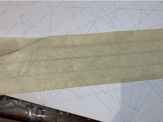
It is important to get excess lead off the canvas; otherwise it will smudge into the paint, especially white and the lighter colors. Below, you can see all the “extra” lead that the tape took off. There is still enough laid down to see the grid at the end of cleaning . I went over the canvas many times with the masking tape until no more lead came off. As a final cleaning step, I wet paper towels with water and washed the canvas. Like with the tape, I did this until no more lead color came off (several washes). Then I let the canvas dry thoroughly before beginning to paint.


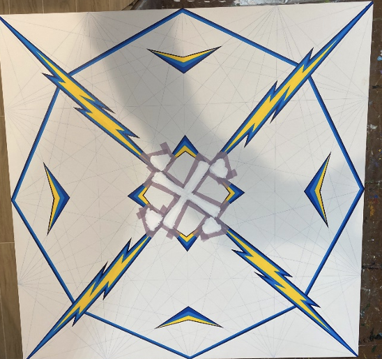
Final canvas – now ready for the paint. I decided early on to do the lightning bolts first, and to make them with more vivid colors than the remainder of the canvas so they would really pop.

I did one color at a time, always using painter’s tape to outline the shapes I was about to paint to get nice straight edges. In fact, the choice of canvas is important because if the surface is too “toothy”, then the paint tends to run underneath the tape outlines (a big no-no for me). I decided on the main colors based on the blue and yellow “color wheel” poster board I made. Between each color application, it is important to thoroughly dry the paint; otherwise, the colors will smudge or lift off with subsequent tapings. Altogether, this painting used around 9 or 10 rolls of tape. My “studio” is in our basement. The biggest challenge, as with any painting done in a windowless room, was to get enough light to be able to see everything well.


After the lightning bolts went in, I took a long time to really look at the canvas, to allow it to “tell me” what other features should be highlighted. For example, I saw the center diamond, and used the same vivid lightning bolt colors to make the central focal point. I added the four flying “vees”, to complete the focal points for the painting, again with the more saturated blues and yellows. My client is in the airline industry, and I think subconsciously I was referencing his aviation associations.
Next, I got to work on the background, carefully choosing colors that got along with the primary colors in the focal point areas. I chose less saturated colors for the background to keep the “pop” of the main features. The painting is symmetric for the most part, and my goal with each color was to distribute them evenly in a beautiful way that made sense to the overall piece.


The process is precise and ordered and gradual. Painting like this requires a lot of patience and the process can be slow. Each color is laid down separately, and between colors I take a good long look at the canvas and then determine what color it needs next. There is always a lot of touching up to get the lines and corners straight. In total, this painting probably took 80-100 hours to do. I usually paint early in the morning before I go to work, at nights and on weekends. Finally, I apply one or two coats of protective varnish, usually a satin finish.
Here is the painting after all the colors went in, the final touch-up and varnish steps. I was pleased that the focal points (lightning bolts, center diamond and the flying vees) all still popped out. In total, I used 17 colors in the painting, including 5 custom-made colors, 5 metallic colors (that have mica granules in them to give a sheen), and 2 transparent blues applied by bouncing the brush to give texture. Happily, my client loved “All Charged Up” and has it hanging in his office.