3 foot high statue, 8/2026
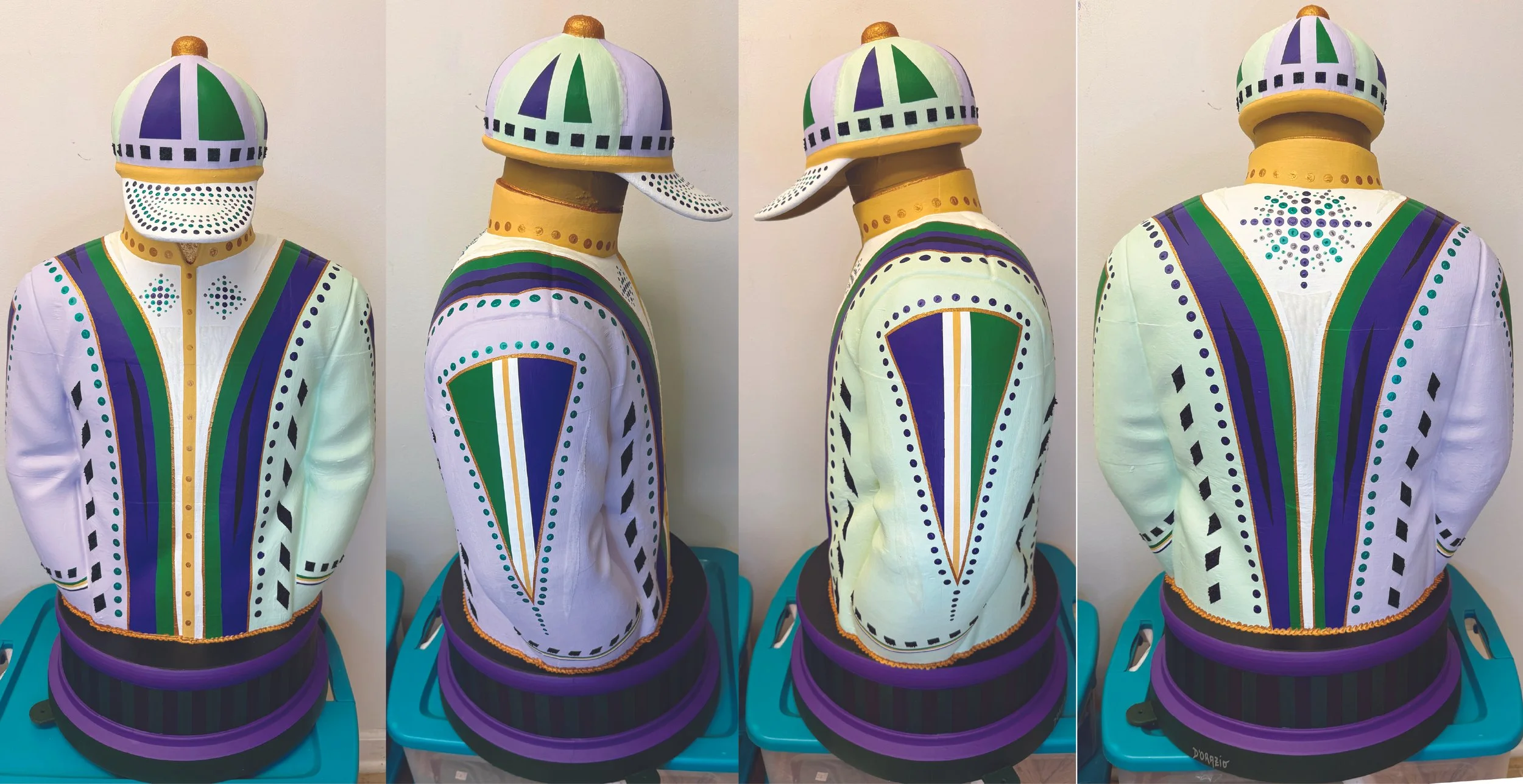
I was chosen to design one of fifty jockey silk sculptures to celebrate the Breeders’ Cup held in Lexington KY in the Fall of 2026. I submitted three concept ideas – (1) rainbow themed to celebrate hope and optimism, (2) blue, yellow and white – the colors of Lexington, and (3) a mandala-based piece in purple, green and gold – the colors of the Breeders’ Cup. The committee chose the third theme, and so I picked up the statue from ArtsPlace, and had six weeks to do something with it. I decided that I wanted to have it look like an actual jockey silk, so that’s how I approached it. I sanded it down in many places (it was glued together with a lot of rough spots), and primed it three times before starting on it with acrylic paints. I chose to incorporate various shades of purple and green to give it interest - lavenders, emerald greens, deep purples, and dark greens, highlighted with golds and whites to give the piece a festive but dignified presence. Repeated geometric motifs down the sleeves, on the cap and on the front and back are intended to denote speed, ceremony, and competition.
The color choices directly connect the sculpture to the visual identity of the 2026 Breeders’ Cup. Deep purple provides gravity and a sense of pageantry; green adds vitality and turf-like energy; gold suggests prestige, prize money, trophies, and championship; while white and soft lavender create light, contrast, and breathing room.
The colors are applied structurally. Purple and green panels rise and taper across the chest, back, and helmet, creating a strong vertical rhythm. Gold outlines sharpen the forms and lend the garment the finish of a ceremonial racing uniform. Repeated dots, squares, diamonds, stripes, and tapered panels animate every surface. The piece has a lively, almost Art Deco character: crisp, symmetrical, decorative, and built from bold contrasts.
The sculpture is an homage to the coded beauty of racing silks. In horse racing, colors and patterns carry identity: they distinguish owners, riders, and horses in the compressed drama of a race. My intention is to expand that tradition into public art to celebrate not only the spectacle of the Breeders’ Cup, but also to honor the sport’s visual culture.
Color is the principal force that differentiates the works, with distinct color fields ordered, in general, by their relationships on a ROYGBV color wheel. Although the compositions are highly geometric, varied surface textures prevent them from becoming monotonous. Vertical strips suggest fragmentation, and their irregularity hints at the time and effort that went into developing chromatic systems. That textural variation also makes the color more complex. A turquoise strip is never simply turquoise, for example—it may appear mottled, woven, scratched, or slightly opaque beside a cleaner adjacent band. The effect is similar to listening to a sustained chord in which individual instruments remain perceptible.
“The Echo Series” can be interpreted as an exploration of recurrence rather than duplication. Each painting begins with the same compositional proposition, but the shifting palette demonstrates how a stable form can carry radically different affective meanings. Together, the series feels like a study in resonance: color moving outward, pattern returning inward, and visual energy repeating with meaningful difference. The works invite viewers to notice how perception changes when structure remains constant but atmosphere changes completely.
We named the piece “Javier ” because it felt like there was a person in the room anywhere he was in the house, and somehow he seemed like he might be called that.