Inferno
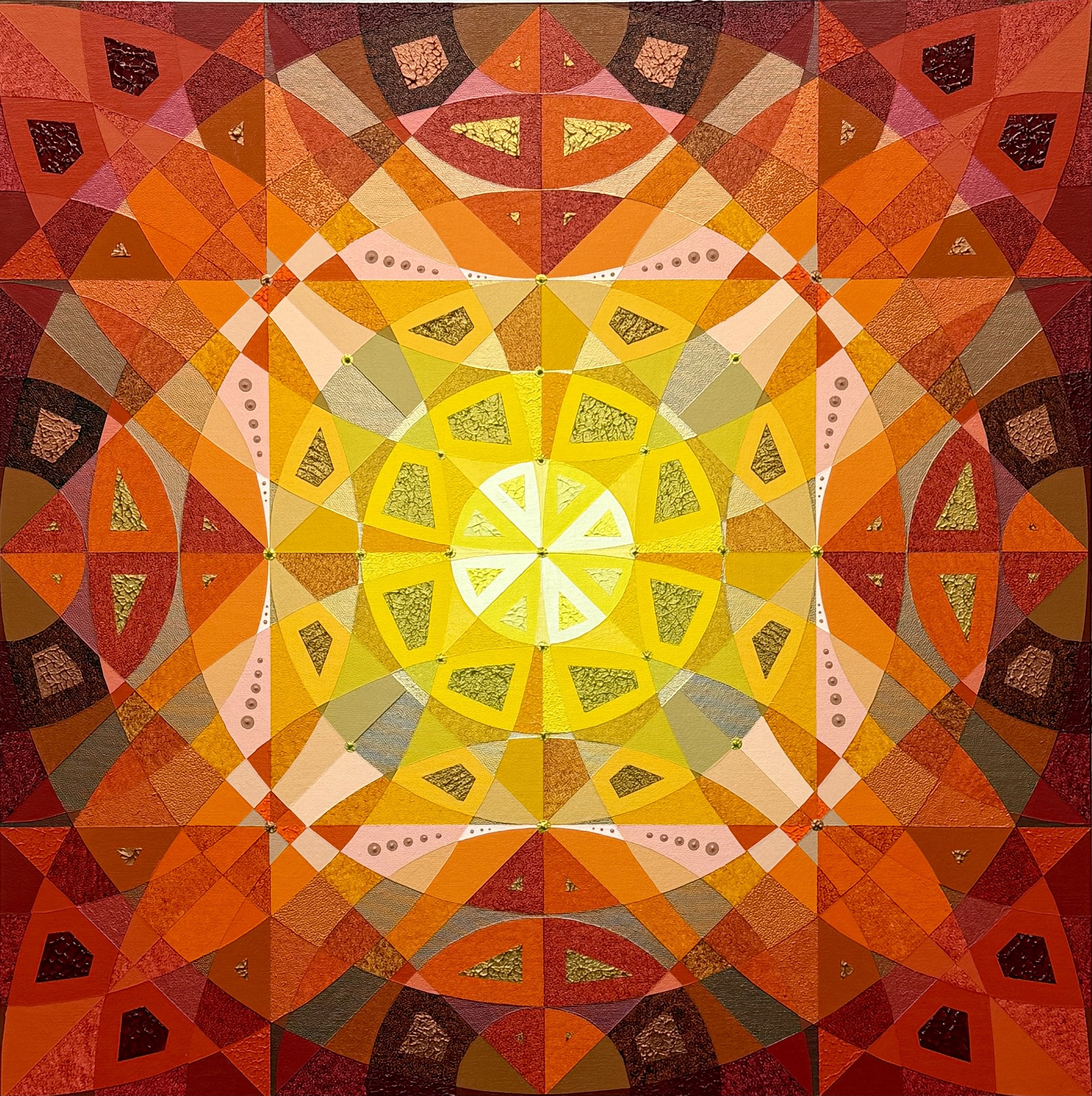
24 in x 24 in
4/2026
I was thinking of fire when I developed “Inferno”. At the center, a yellow core represents the sun made up of a white‑hot still point from which concentric rings of segmented forms radiate outward. Moving away from the center, the colors become progressively darker and redder, recreating energy cooling as it travels away from its source. The painting conforms to a radial symmetry, which has the effect of re-centering the eye to the “hot” center. The color palette stages a full drama of temperature: lemon and cadmium yellows shift into ochres, oranges, and ember reds, with occasional browns that suggest char and ash. “Inferno” proposes fire as a spectrum with each wedge a different register of heat. Small patches of textured, cracked surfaces evoke scorched earth or molten material cooling into crust, adding a tactile counterpoint to the otherwise smooth, mathematical division of space.
The title “Inferno” invites associations with Dante’s descent, but instead of torment, the mood feels contemplative - a meditation on what it means to stand before something overwhelmingly bright and hot yet perfectly ordered. Fire is a paradox because it can be both destructive and generative. It is a force that consumes while creating light, a threat that also becomes a source of orientation. In holding that paradox within such an exacting, luminous geometry, “Inferno” turns catastrophe into pattern and invites the viewer to dwell, for a moment, inside the heart of a flame.