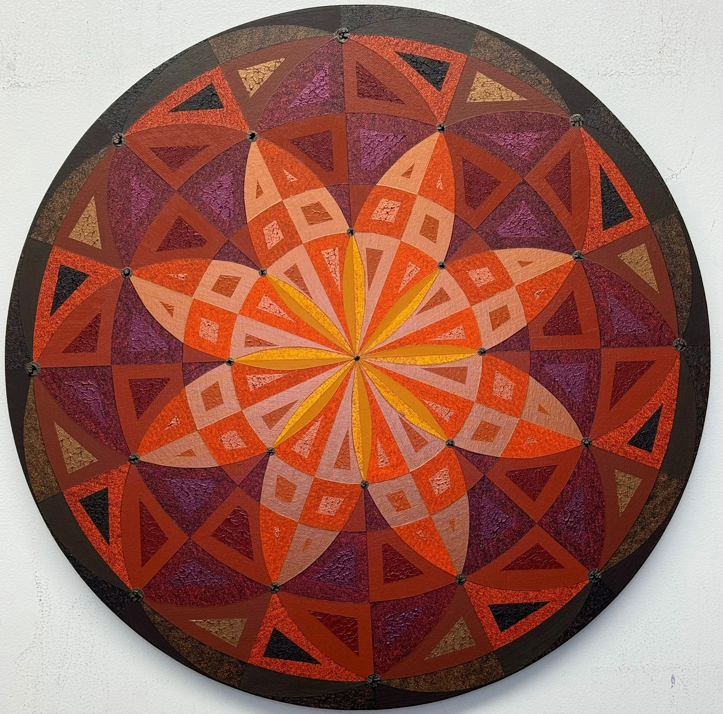
24 in diameter
10/2026
I developed this painting about the time Fall came to us, and wanted to explore Fall colors and textures in a round (tondo) canvas format. I intentionally went for darker hues of yellows/golds, oranges, crimsons and browns. The piece’s repeated shapes establish order, but curved boundaries, textured surfaces, and glowing center keep that order from feeling mechanical. It reads simultaneously as a flower, a turning wheel, or an autumn sun—associations that reinforce one another without resolving into a single literal subject. Long, golden petals converge at the center, while overlapping arcs carry the eye outward through successive bands of pattern. Your gaze moves between two impulses: following the spokes toward the middle and traveling around the circumference. That tension gives a stationary, highly ordered design a convincing sense of rotation. Scale shifts from the center (lighter) to the edges (darker), and shapes become larger. The palette is intended to communicate autumn without relying on recognizable leaves or landscape imagery. Orange and rust provide heat, pale peach creates breathing room, and burgundy and plum give the composition depth. The yellow-gold forms at the center feel especially luminous because they sit within those darker, earthier surroundings. The light appears to come from within the design rather than fall across it from outside. Incorporation of lighter passages interrupt what might otherwise become an unrelentingly fiery palette. They separate adjacent shapes, clarify the interwoven curves, and give the brightest oranges something softer to play against. Texture is also important to the work. The contrast between relatively smooth bands and rough, crackled-looking passages gives interest and suggests something enduring, while the irregular surfaces suggest weathering and change. Autumn emerges not just through warm colors, but through a tension between intact structure and surfaces that appear to be aging. To me, many of the colors and textures remind me of leather. Small round dots of Van Dyke Brown at key intersections act as fasteners, making the pattern feel assembled or joined. The outer pattern is intended to contain the work. There is no single place where the eye should stop.