Achromatic Hexaptych
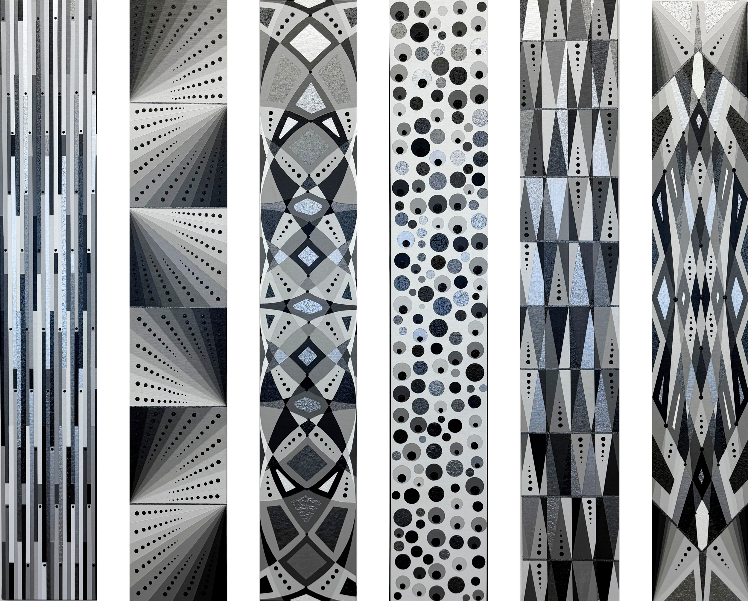
6 in x 36 in each,
3/26
I was inspired to do a hexaptych (a set of six paintings) by the tradition of famous sets of paintings in art history such as diptychs (a set of two paintings; think of “Marilyn Diptych” by Andy Warhol), triptychs (a set of three paintings; think of “The Garden of Earthly Delights” by Hieronymus Bosch), or sets of paintings of even higher numbers (think of the “Ghent Altarpiece” by Jan van Eyck that has 12 panels). My vision was to make a set of six “extreme rectangle” paintings (each canvas 6 inches x 36 inches), painted with identical shades of whites, blacks, grays and silvers, united by geometric shapes but differing in their patterning. I started by drawing grids onto the canvases and settled on themes of (1) vertical lines, (2) dividing the canvas lengthwise into sixths and drawing triangles differing from each other by 10 degrees, (3) all arcs and rounded lines, (4) polka dots all over, (5) mostly triangles, and (6) a conventional grid drawn from the edges and equidistant points on the side. I used one color at a time applied across the different canvases simultaneously, so for example, I started with “N2 Gray” and applied it to all six canvases, and then “N3 Gray” and so on such that, for the most part, every canvas shares each color. Then, to finish the work and give unity to the hexaptych, I decided to add black Mandala dots to each canvas, in a way that made sense for the pattern of the individual piece.
Taken together, the hexaptych reads as an exploration of variation within constraint: one narrow vertical format, an achromatic palette, and a tightly controlled vocabulary of stripes, triangles, circles, and radiating wedges. Each panel feels like a distinct “movement” in a suite, but they are bound together by rhythm, repetition, and a shared grayscale timbre. The achromatic range—from nearly pure white through soft silvers to deep charcoal—pushes attention away from color and onto value, texture, and pattern. Subtle differences in sheen and surface (matte vs reflective, flat vs textured) become the stand-ins for chromatic contrast, so “color” is experienced as temperature of light rather than hue. This heightens a sense of order and clarity while still allowing for sensuality in the materials.
The individual panels vary from linear to radial to lattice to crystalline, as though the system is testing every way a grid can be bent, rotated, or densified. What holds the ensemble together is a strong sense of underlying algorithm: dots march in measured sequences, wedges expand at consistent angles, triangulated fields repeat with measured variation. Despite the rigorous structure, the panels that feel expansive and radiant alternate with ones that feel dense and compressed. Together they trace an emotional arc from analytic calm to almost ecstatic complexity. The challenge to the viewer is to decide whether to treat each panel as a different “mode” within a single visual system (like scales in music), or are they merely six individual pieces that happen to coexist in one frame.